Craftyfish
Craftyfish is the mother ship of Logomarque.com and it was conceived in London in 1998. In the ensuing 20 years this is the first major update to its identity. A highly stylised rendition of the letters ‘C’ and ‘F’ —with a subtle reference to a fish hook— in the brand colours of Craftyfish that takes its inspiration from the Pop Art aesthetic. Recently rolled out in the new Craftyfish online boutique which can be found here: Urban Tees
Read More ›
Celi-Battants
Celi-Battants: Lille, FRANCE. A pro bono logo project for a club of semi-retired Lillois. The name of their club is a play on words. ‘Celi’, short for célibataire- that’s singles to you and me! And ‘Battants’ meaning fighters (against being single). Quite sweet. Hmmmn logo, I love you! Postcript. Made this logo without prior knowledge of the Kiss Kiss Bank Bank crowdsourced thing that looks remarkably similar.
Read More ›
PULP
PULP: Paris, FRANCE. PULP LIQUIDE stands head and shoulders above the many sub-standard cheap imports that occupy the market. Accordingly, the branding reflects the quality ingredients and design aesthetic behind the company and positions PULP LIQUIDE as a high-end quality product for the discerning vapeur. Website More info on this project
Read More ›
The Green Republic
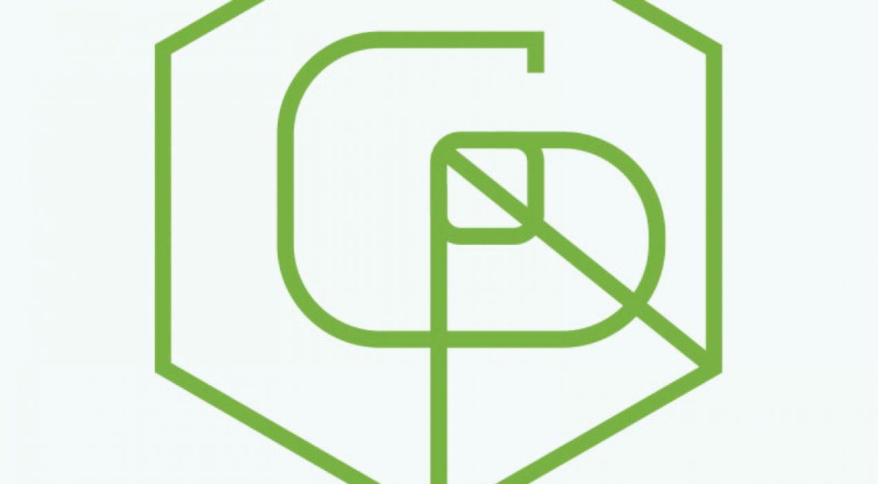
The Green Republic: Paris, FRANCE. French startup that will provide bespoke urban terrace garden solutions. In the Green Republic logo we see a ‘G’ and a ‘R’ that are spines in a leaf. At the same time the ascender of the ‘R’ is the stem of the leaf that is hexagonal in shape. It could also represent a tree. The hexagon is also a device that represents the state of France. It is a Company that is aiming to turn many corners of the city into green enclaves. The form of the leaf and the hexagon is also a cube which makes reference to the modular approach of much urban and inner city housing developments. The stem of the leaf and the descender of the ‘R’ are also the vertical and diagonal axis’ of the cube.
Read More ›
P&G Everyday Me
EverydayMe: GLOBAL P&G Everyday Me is a suite of websites for Proctor and Gamble (P&G) that provides a host of useful information and special offers for busy mums’ around the globe. Each site is localised for its own particular market and appears in the country’s native language. Importantly, the logomark had to be flexible enough to be adapted to each market’s specific needs and mother tongue. Furthermore, the symbol with ‘Me’ inside was often adapted to use a local language variation as was the baseline. The website shown here was the original Hungarian iteration. The logo is still current, however the website has since been modified and updated. Examples of localised sites. (May have changed from the original spec) Everyday Me India Everyday Me Arabia Everyday Me Belgium Everyday Me Russia
Read More ›
Station on Tanti
Station on Tanti Family and Women’s Clinic, Mornington, AUSTRALIA. The Station on Tanti is a fresh, modern and sophisticated GP owned boutique clinic. They provide expert, professional and personalised care to patients in the Mornington Peninsula near Melbourne Australia. Website
Read More ›
Falafel Prophecy
Falafel Prophecy, Edinburgh, SCOTLAND. An independent enterprise based in Scotland that blends a fusion of styles in its branding. Encompassing pre-Columbian central and southern America, far eastern buddhist and African cultures. In addition to the authentic feel, this startup has great back story to back it all up. John, the proprietor travelled to Israel and immersed himself in the falafel culture in order to obtain the absolute most authentic taste experience. A company built with passion for its product!
Read More ›
Andrea Allardyce
Andrea Allardyce: London, ENGLAND. Reflexology, Acupuncture and Massage Therapy are amongst the many holistic health remedies offered by this London based alternative health therapist. Craftyfish created the visual identity and developed branded materials
Read More ›
