Hmmn logo I love you!
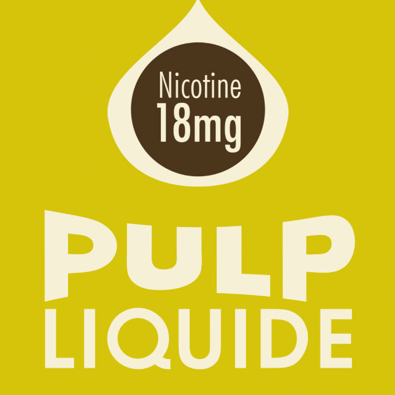
Pulp Liquide:
Paris, FRANCE.
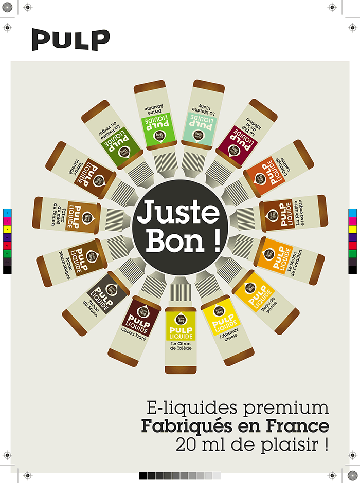
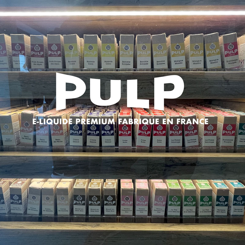
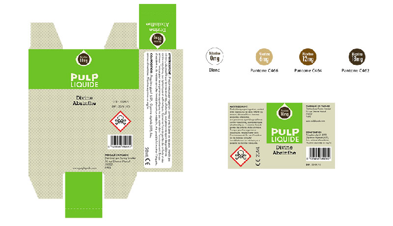
Branding development encompassing; logo, point of sale packaging and posters for Pulp Liquide, a French producer of e-liquids for electronic cigarettes.
Pulp Liquide stands head and shoulders above the many sub-standard cheap imports that occupy the market. It uses authentic flavours produced in France and accordingly the branding reflects the quality ingredients and design aesthetic behind the company and positions Pulp Liquide as a high-end quality product for the discerning vapeur.
In 2013 whilst walking the streets of Paris I noticed a vape shop called Sunny Smoker that was using the Open source typeface ‘Lobster’ in its logo. I was intrigued and wanted to know more so I ducked in to peruse the goods on offer and asked the Patron if it was he who designed the logo. He said “oui, Bien sûr” and quizzed me about why I wanted to know. I explained that it was every designer’s nemesis typeface —along with Comic Sans, obviously and that it wasn’t a great choice, citing over-use on everything by everyone who has access to a PC and a copy of Word! He said, “Dans ça case, j’ai un projet pour toi”… “Can you design a logo and come up with a brand personality for my new product? It’s called Pulp. I said yes obviously, and the rest is history. —The addition of ‘Liquid’ to the hand-drawn wordmark was a shame but maybe they needed to skirt around any IP demands fellow Parisian Mr Jarvis Cocker may have had on the name 😀
